
30-Apr-2025
Remember when flat design and simple icons were all the rage?
In 2025, UI designers are taking things up a notch with fresh ideas and techniques that make digital experiences more engaging. From bold visual styles to cutting-edge technology integrations, the UI trends on the horizon are all about making interfaces feel more lively, personal, and fun to use.
In this post, we’ll explore 14 exciting UI design trends to watch in 2025. Let’s dive into what’s hot in UI design, along with real-world examples showing these trends in action.
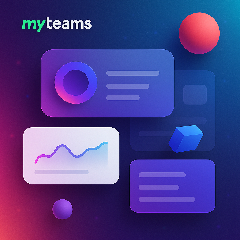
Modular or “bento box” UI divide the interface into clear, content-packed tiles or sections, much like a bento box lunch with neat compartments. Each bento box UI section lives in its own container, making the screen feel organized and digestible.
This UI design trend originally gained traction in data dashboards, where separating info into cards made complex data easier to scan. Now it’s popping up in mainstream web and app designs as well.
A modular bento box UI helps prioritize content without distractions.
By giving each piece of content its own “box” users can focus on one thing at a time while still seeing an overview of multiple things on one screen. It’s flexible and visually clean, perfect for showcasing diverse content types side by side in a cohesive way.
In 2025, as interfaces handle more and more information, bento-style grids keep things tidy and user-friendly. Take a look at modern news websites or personalized dashboards. For instance, many homepage portals now feature card-style sections for weather, top news, social feeds, and more on one page.
Google News, for example, arranges headlines into separate cards by topic (World, Sports, Tech, etc.), so you can quickly catch up on multiple categories at a glance. This compartmentalized approach is exactly what the bento box layout trend is about everything in its place, easy to find and interact with.

Flat design is cool, but 3D elements are bringing depth and realism to UIs like never before. Immersive 3D graphics involve using three-dimensional illustrations, interactive objects, or environments directly in the interface.
Think of product images you can spin 360°, buttons that look like tangible objects. With better device GPUs and libraries like WebGL, designers can integrate rich 3D content seamlessly into websites and apps.
As technology advances, people crave more engaging experiences. 3D elements instantly grab attention and can communicate information in intuitive ways. For example, showing a product in 3D is far more interactive than a static photo.
In 2025, with AR and VR on the rise, users are getting used to immersive UI. Incorporating 3D into everyday interfaces blurs the line between the digital and physical. It also opens the door for features like virtual try-ons or interactive demos right on a website.
E-commerce is a big adopter of this trend. IKEA’s mobile app lets you view furniture in 3D and even place a virtual sofa in your living room using AR. On the web, product pages for smartphones or cars often have 3D models you can examine from every angle.
Kinetic typography refers to text that moves or changes dynamically in the interface. We’re talking animated headlines, letters that wiggle or expand, or text that smoothly slides into place as you scroll.
Rather than treating text as a static element, designers are giving words some motion to inject personality and grab eyeballs. This can be as subtle as a word that fades in with a slight zoom, or letters flying across the screen to form a headline.
Text is not just for reading, it can also be a design centerpiece. Animated typography draws attention to important messages and sets the tone of a site instantly. In 2025, as users scroll quickly through content, a bit of movement in a phrase can make them pause and take notice.
Kinetic typography also conveys emotion or branding. For example, bouncy, playful text animations give a fun vibe, whereas sleek, minimal fade-ins feel elegant. With modern CSS and animation libraries, it’s easier than ever to implement, so designers are using it to ensure key copy literally makes an impact.
You might have seen this on creative agency websites or portfolio pages. Apple’s product pages often use kinetic typography in their introductions. Another everyday example is Instagram Stories or Reels text stickers, which can animate to emphasize what you’re saying. By 2025, even more apps and sites will feature text that moves, making words as engaging as images.


Who says digital interfaces have to feel completely flat and perfect?
A growing UI trend is adding blur effects and grainy textures to backgrounds or UI elements to create depth and a touch of realism. A blurred backdrop makes the foreground content pop while giving a sense of layers.
Grainy texture, essentially a fine noise or film grain overlay, breaks the clean vector look and adds an organic feel to the UI. These elements are usually subtle, a soft-focus background image here, a tiny speckle overlay there, just enough to make the design feel more alive.
After years of ultra-flat and smooth designs, users are responding to interfaces that feel a bit more … human. Tiny imperfections like grain can make digital surfaces seem friendlier, as if you could almost touch them.
Blur effects, on the other hand, provide depth and focus. By blurring out certain areas, designers guide your eyes to what matters, almost like portrait mode in photography. Together, these techniques create a “vibe”, a moodier, more atmospheric interface that stands out from sterile layouts. As we head into 2025, expect more apps to embrace this layered look to give interfaces a subtle sense of richness and soul.
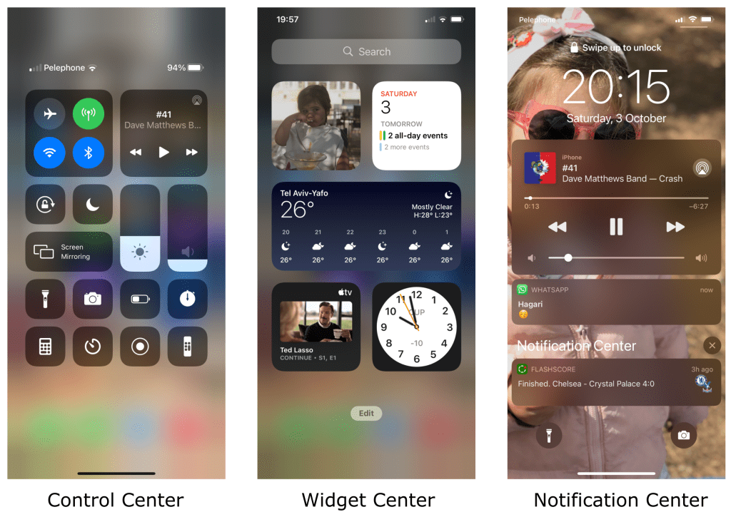
Apple’s iOS has used frosted blur panes in its Control Center and notifications for years. Now you’ll see blur used on many websites for menus and pop-ups, creating a background haze so the menu stands out.
Grainy textures are popular in modern graphic design. For example, the Spotify Wrapped graphics each year often have a slight grain to give them character. Some trendy portfolio sites apply a gentle grain filter to background images so they feel more artsy and unique. These real examples show how a bit of texture can make a UI feel less digital and more inviting.

Dark mode UI has been a hit for a while. Many of us love flipping that switch to give our eyes a break at night.
In 2025, dark mode UIs are evolving beyond just inverting colors. The trend is “low-light” design, which means interfaces that use not only dark hues, but low contrast and softer colors overall for a calm, evening-friendly aesthetic. It’s like dark mode 2.0. Instead of pure black and white high contrast, low-light themes use deep grays, muted tones, and gentle highlights to create a soothing, glow-like ambiance.
Users have gotten used to dark mode as a standard option. Now designers are refining it to be even more comfortable. Low-light designs are easier on the eyes for extended periods, reducing strain without sacrificing style. They also just look modern and sleek when done right. With increasing focus on digital well-being, providing a less glaring interface is seen as a plus.
A low-light UI can make late-night browsing or working feel relaxing rather than harsh. This trend shows designers acknowledging that context matters. An app you use at midnight might benefit from a different vibe than one at noon. So beyond just offering a “dark mode,” apps are experimenting with palettes that are dimmed, dusted with color and accented by soft glows.
Many popular apps have introduced refined dark themes. Twitter has both a standard dark mode and an extra-dim mode which is a pure black theme. Now we’re seeing apps like YouTube use dark gray backgrounds with subtle dark red or blue accents, creating a movie-theater feel.

Neumorphism (short for “new skeuomorphism”) is a UI design trend that blends flat design with subtle 3D elements, resulting in a soft, almost plush look. In a neumorphic design, components like buttons, cards, or toggles aren’t flat or starkly raised, instead, they appear as if they’re extruded from the background, with delicate shadows and highlights.
UI elements that look embedded into the interface, with a light, modern embossing. You’ll notice:
Neumorphism first made waves a couple years ago in design circles as an experimental style. By 2025, it’s matured and is finding practical use in interfaces where a fresh look is desired. It’s visually intriguing, users often comment that neumorphic elements look “touchable” and elegant.
This style is great for focusing attention on interactive elements because the components subtly stand out from the background without using loud colors or heavy borders. It’s the middle ground between flat design and older skeuomorphic design. Neumorphism UI design trends carry a modern simplicity but with depth, aligning well with minimalistic trends and our increasingly high-DPI screens that can show those fine shadow details.

You might have seen neumorphism in action in some modern fintech or health apps where the design needs to feel calm and trustworthy. For example, a budget tracker app might use neumorphic cards for each spending category, so they look like gently raised panels on the screen.
There are also concept apps and smart home dashboards floating around with neumorphic toggles. Imagine a light switch in an app that looks like a pill-shaped button slightly indented in the background until you “press” it.
While not every big brand has adopted full-on neumorphism, elements of it appear in recent designs by companies like Google, which has added more rounded, raised feels to its Material Design components. Keep an eye out for subtle shadows and highlights, that’s neumorphism making its mark.
Minimalist UI design trends aren’t new, but it’s definitely not going away.
In 2025, minimalist UI is all about doing more with less, stripping interfaces to their core essentials and making every element count. That means lots of white space, limited color palettes, simple typography, and only a handful of buttons or menus on screen at once.
But this new wave of minimalism isn’t just about a clean look It’s about intentionally guiding the user’s focus to content or key actions by removing clutter. In other words, it’s minimalism with a strong purpose behind each design choice.

As apps and sites pack in more features, there’s a counter-trend to simplify the visual presentation. Users appreciate when an interface feels simple, intuitive, and not overwhelming. A minimalist UI design loads faster and often translates better across different screen sizes.
In addition, with the explosion of information we all deal with, a sparse, well-organized UI can be like a breath of fresh air. In 2025, expect designers to continue embracing minimalism but with:
It’s the art of reduction, making sure that what remains on-screen is exactly what the user needs.
Look at the home screen of Google’s search, there’s a clear minimalist UI approach. Google famously has just a logo, a search box, and a few simple options, nothing cluttered, which directs your attention immediately to searching. Notion and other productivity apps often hide less-used controls behind menus to keep the workspace clean until you need them.
Who says a user interface has to be something you tap or click?
Voice User Interfaces (VUIs) allow users to interact with software through spoken commands, and other touchless UIs might involve hand gestures or body movement. In essence, voice UI extends beyond the screen into the realm of sound and motion. This trend includes everything from voice-activated smart assistants (Alexa, Siri) to cars controlled by voice or gesture, and new devices like AR glasses that track where you look or point.
The visuals for these voice search UI are often minimal because the primary interaction is via voice or sensors, but there will still be feedback on-screen, like visual waveforms, subtitles, or simple menus to confirm the system is listening.
Thanks to AI improvements and consumer comfort with talking to devices, voice search UI have boomed. By 2025, it’s almost expected that any sophisticated app or device offers some voice control option for convenience.
People love the hands-free ease, whether it’s asking your phone to set an alarm while you’re cooking, or telling your TV to search for a movie. The pandemic also accelerated interest in touchless interactions in public spaces.
For UI designers, this trend means designing feedback for voice commands and simplifying screens to complement voice. It’s a shift from purely visual design to multimodal design, where speaking and hearing become part of the user experience.

Smart speakers and assistants are everywhere, just think of how many people say “Hey Google” or “Alexa” daily. Those are essentially user interfaces driven by voice. In the car, systems like Tesla’s voice controls or Apple’s CarPlay let drivers do things like “Call Mom” or “Play chill music” without touching a screen.
On smartphones, apps like Google Maps let you speak a destination instead of typing, and you’ll see the route appear, a blend of voice UI and visual UI working together. And with devices like the upcoming AR glasses and the Apple Vision Pro headset, expect gestures to introduce new forms of touchless interaction. Designing for voice and touchless control is a trend that’s making UIs more accessible and convenient than ever.
Microinteractions are those tiny, almost subconscious animations or responses you see when you perform a small action in a UI. Think of a heart icon that bursts into colorful confetti when you “like” a post. These are micro in that they usually involve one small element and last just a second or two, but they add a ton of delight to the user experience.
In 2025, designers are peppering interfaces with these playful animations to bring UIs to life. This trend covers everything from loading spinners with personality to hover effects that make buttons glow.
Users have come to expect a certain level of polish in modern apps, gone are the days of static and lifeless pages. Microinteractions serve a functional purpose while also giving a brand some character. They guide the user subtly, a shake on a wrong password field says “try again”, a progress bar that pulses softly says “I’m working on it, please wait.”
Importantly, these animations make using the interface more fun. As attention spans shrink and competition grows, a delightful microinteraction can be the little spark that makes someone smile and remember your app. The trend in 2025 is towards thoughtful, not gratuitous animations, the sweet spot where they enhance usability and personality, but don’t distract or slow anything down.

There are endless examples. One famous one is Facebook’s Like button. When you hold and press, you get a burst of animated reactions flying out, which has become a signature interaction. Twitter’s heart icon similarly gives a quick burst animation when tapped.
On a more utilitarian note, Google’s Material Design introduced ripples that radiate out when you tap a button, giving immediate visual feedback. Apps like Duolingo use microinteractions like cute character animations and encouraging checkmarks to reward you for each answer.
Say goodbye to boring color schemes, 2025’s UIs are awash in vibrant hues and dynamic gradients. This trend is all about bold color choices like bright pastels, neon accents, and unexpected color combinations that make interfaces pop.
Alongside bold solids, gradients (blends from one color to another) are making a big comeback, often in eye-catching duotone styles or multi-color spectrums. Rather than the subtle, washed-out gradients of the early 2010s, we’re seeing high-contrast, nostalgic color fades that give a modern interface a splash of retro flair.
Color is one of the quickest ways to grab a user’s attention and convey personality. With so many apps and websites out there, a distinctive color scheme can set a brand apart instantly.
Bold colors also resonate with the current nostalgia trend, many designers are pulling inspiration from the 80s and 90s, eras known for their vibrant, sometimes clashing color palettes. At the same time, advanced display tech (OLED screens, HDR) make bright colors and gradients look absolutely stunning, so it’s a shame not to use them.
In 2025, expect UIs to be more adventurous with color, moving away from all-safe, all-muted tones. When done thoughtfully, a bright interface can still be clean and professional while injecting some much-needed energy.

Look at the branding for services like Spotify, Snapchat, or Instagram. Spotify’s UI is dark overall, but they aren’t shy about neon green accents and multi-color artwork for playlists. Instagram’s logo itself is a vivid gradient and we see that trend echoed in many apps’ onboarding screens and buttons.
Fintech and crypto apps like Coinbase or Robinhood have started using bold blues, purples, and greens in gradients to appear modern and vibrant, steering away from old-school bank stoicism. Even enterprise software is adding color, Microsoft’s recent Fluent design updates introduced more saturated color options for its app icons and themes. All around, interfaces are getting more colorful and visually exciting, making digital experiences more memorable.
Immersive scrolling, often dubbed “scrollytelling,” is a trend where the simple act of scrolling down a page becomes an interactive storytelling experience. Instead of a static scroll that just moves content up, immersive scrolling triggers animations, transitions, and dynamic content changes as you move.
Sections might fade in and out, images might slide or zoom to reveal new details, and text might appear right when it’s relevant to the visuals on screen. Essentially, the page responds to your scroll position in a fluid, often cinematic way, guiding you through a narrative or presentation.
Scrolling is the most natural action on web and mobile – everyone knows how to swipe or mouse-wheel. By making scrolling more engaging, designers can keep users on a page longer and direct their attention in a desired sequence. It’s a powerful way to tell a story or explain a concept step by step.
In 2025, as tools and libraries for scroll-based animations have matured, more websites are adopting this technique to stand out. It’s especially popular for product showcases, interactive articles, and one-page websites. However, designers are also learning to use it judiciously – the trend is towards meaningful immersive scrolling that enhances understanding or enjoyment, rather than gratuitous effects. It’s like creating a mini journey for the user, right within a single page.
Explore the fantastic immersive scrolling preview for the game Hard West 2 :

One of the classic examples was the New York Times “Snowfall” feature a while back. As you scrolled, the images and text unfolded a story in a mesmerizing way. These days, you can see immersive scrolling on many tech product landing pages.
Apple’s website is a prime example: scroll through an iPhone or MacBook product page and you’ll notice elements elegantly slide in, key features animate, and backgrounds change color to match the story being told.
Automotive websites showcasing a new car model often let you scroll to rotate the car or animate its features into view. Even some portfolios and resumes use scrollytelling to walk you through someone’s experience in a more engaging narrative. All of these show how turning scrolling into an experience is a trend capturing users’ curiosity.
Augmented Reality (AR) and Virtual Reality (VR) are no longer sci-fi, they’re becoming part of everyday UI design considerations. AR involves overlaying digital elements onto the real world (as seen through a phone camera or AR glasses), while VR creates an entirely digital environment around the user (usually via a VR headset).
For UI, this means designing spatial interfaces, think menus floating in mid-air, 3D buttons you can “touch” in a virtual space, or labels and arrows that appear on real-world objects through your phone screen.
The trend here is that designers are extending UIs beyond flat screens and into real-world context or 3D space, creating new interaction patterns that leverage depth, location, and even movement.
With devices like the Apple Vision Pro and advanced AR on smartphones, AR/VR is poised to become much more mainstream in 2025. As more users experience AR filters, AR shopping tryouts, or VR games, the expectations for those interfaces to be intuitive and attractive grows.
Designers are now tasked with thinking in 3D, how to place UI elements so they’re readable in space, how to guide a user who might be moving around, and how to provide feedback in AR/VR.
It’s a whole new frontier for UI design, and getting it right is crucial as AR blends with daily apps and VR continues to grow in gaming, training, and virtual meetings. The trend is essentially the spatialization of UI, interfaces are breaking out of the screen and into our environment.

Snapchat and Instagram filters are simple AR UIs many people use. For instance, when you use a dancing AR hotdog or try on a digital hat, the app has to provide UI cues (like a pause button or a “try with a friend” option in AR).
In more practical use, Google Maps’ Live View AR feature shows arrows and directions overlaid on the real street when you hold up your phone, merging UI with the physical world to help with navigation.
On the VR side, apps on the Oculus Quest/Meta Quest have virtual dashboards and environments where you point at icons in a 3D space to launch apps or adjust settings. And with the anticipated Vision Pro, we’ll likely see productivity apps where your calendar, email, and web browser are all floating windows around your room. These examples underline how UI design is adapting to AR/VR – it’s a trend that’s just going to get bigger as the hardware becomes more common.
Inclusive design in UI is the practice of making interfaces usable and welcoming for as many people as possible, especially those with disabilities or different needs. This trend encompasses accessibility features (like high-contrast modes, scalable text, screen reader support, keyboard navigation) built right into the UI, as well as thoughtful design choices that consider diversity in users (from color blindness-friendly color palettes to using icons and labels that are culturally inclusive).
Instead of treating accessibility as an afterthought or a “checkbox,” designers in 2025 are baking it into the core of their UI work, meaning designs that look great and work great for everyone, whether you have perfect vision or are color blind, whether you use a mouse or only a keyboard, whether you speak the language fluently or rely on clear icons, etc.
There’s a growing awareness and advocacy around digital accessibility. Not only is it often legally required for public-facing websites, but it’s also just good design practice. A UI that is accessible tends to be more robust and user-friendly for all users, not just those with obvious impairments.
In 2025, companies are recognizing that reaching more users (and not frustrating or excluding any of them) is key to success. Plus, tools for testing and implementing accessibility have improved, for example, design software can highlight if color contrast is too low, and there are libraries of accessible components available.
Inclusive design is also a moral and ethical consideration now; the design community is actively discussing and sharing guidelines for it. So the trend is a move away from niche compliance to mainstream adoption: accessibility features like dark modes, text size adjusters, voice narration, etc., are proudly advertised in apps as positive features for all.

Microsoft has been a leader in inclusive design, Windows and Office have extensive accessibility options (like a built-in screen reader, high contrast themes, eye-tracking support, etc.), and they’ve even released an Inclusive Design toolkit for others.
On the web, you might notice more sites with an “Accessibility” button that lets you toggle things like larger text, different color schemes, or alt text on images. Twitter added features so users can provide alt text for images and even gives reminders to add descriptions, a UI nudge towards accessibility.
Netflix and other streaming services now make it easy to turn on subtitles, audio descriptions, and have clean interfaces to access those options, acknowledging different viewer needs. These real-world moves highlight that accessibility isn’t an afterthought; it’s a design fundamental that’s trending towards ubiquity.
Artificial intelligence is shaking up UI design in a big way. One aspect of this trend is hyper-personalization, UIs that adapt to each user using AI algorithms. This could mean content recommendations tailored just for you on a home screen, layouts that rearrange based on your usage patterns, or themes that adjust to your context.
Another aspect is generative design, where AI helps create elements of the UI on the fly. For instance, an AI might generate unique illustrations or icons based on user preferences, or even design entire interface variations for A/B testing. In short, AI is both changing what we see in the UI and how UIs are created.
By 2025, AI isn’t a futuristic concept, it’s built into many apps and services we use. With the success of recommendation engines, users now expect apps to “know” them and serve up a more customized experience. This raises the bar for interface design: the UI should feel like it was made for you, not a one-size-fits-all.
AI makes this feasible by crunching user data and preferences to modify what the interface shows. On the creation side, designers are leveraging AI tools to speed up their workflow. We’re also seeing AI-generated art and graphics becoming indistinguishable from human-made, allowing apps to have endless variations of themes or avatars. The trend is moving toward UIs that are smarter, more adaptive, and even somewhat self-building thanks to AI under the hood.
If you use Netflix, you’ve experienced AI personalization, the cover art you see for the same movie might differ from your friend’s, because Netflix’s AI noticed you tend to click on romantic images while your friend clicks on action-packed ones. The interface is literally changing the thumbnails to suit your tastes.
Spotify’s Discover Weekly and Daily Mix playlists are another example, the UI presents a personalized playlist cover and tracklist just for you each week, which keeps you coming back. On the generative side, consider Canva’s design suggestions or Figma’s AI plugins that can create design elements or copy automatically, they are early steps towards AI-assisted interface creation. Even website builders now use AI to generate entire site templates based on a few inputs. As this trend grows, you might visit an app and find that its color scheme or layout subtly adjusts to how you use it, all powered by AI making interfaces more dynamic than ever.
UI design trends in 2025 are an exciting mix of creative styling and smart technology. From modular layouts that organize content neatly, to AR interfaces that leap off the screen, the common theme is that user interfaces are becoming more engaging, intuitive, and tailored to users’ lives.
Designers are playing with depth through 3D and blur effects, making bold statements with color and typography, and ensuring everyone feels included via accessible design. At the same time, new tech like voice control, AI, and AR/VR is expanding what “interface” even means , it’s not just confined to a mouse and screen anymore.
For designers and enthusiasts, the key takeaway is to stay curious and adaptable. UI design trend come and go, but the driving force is always improving how people interact with digital products. So give these trends a try in your next project, add that fun microinteraction, experiment with a low-light theme, or ponder how AI might rearrange your app’s UI for the better.